Challenge
The frozen-dessert market is filled with bright colours and playful imagery, making it difficult for a new brand to develop a distinctive personality. The challenge was to create an identity that immediately communicated frozen pops while remaining original, flexible and memorable across packaging, retail and promotional applications.
Solution
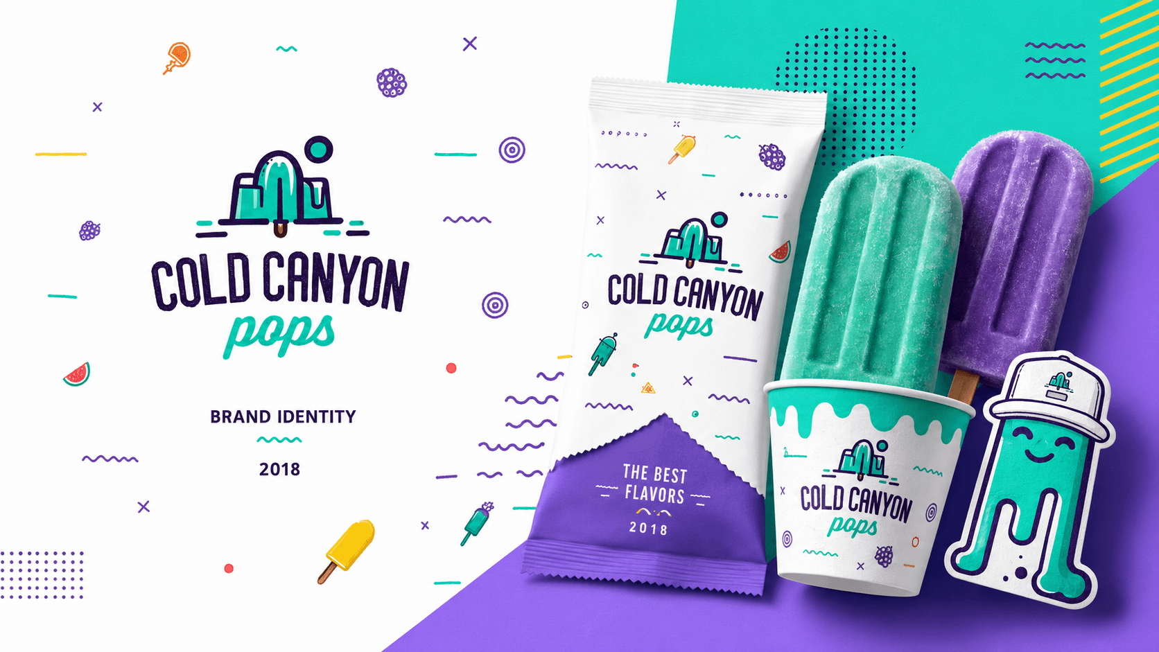
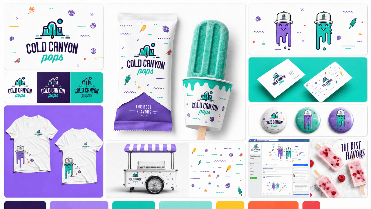
I developed a custom logo that merges a canyon landscape with a melting frozen pop. A bold palette of turquoise, purple, lavender, yellow, orange and coral was paired with condensed typography, hand-drawn lettering and a collection of energetic decorative elements.
Two illustrated melting-pop mascots were created to give the brand additional personality. The visual system was then applied across frozen-pop packaging, business cards, badges, T-shirts, a branded sales cart and social-media content to demonstrate its versatility.
Result
The finished concept established a cohesive and highly adaptable identity that could work consistently across physical products, merchandise, retail environments and digital marketing.
The project received 43 appreciations and 301 views on Behance, demonstrating strong interest in its playful visual direction and illustrated branding system.