Challenge
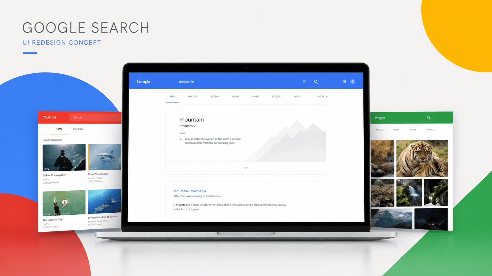
The challenge was to modernise an instantly recognisable search experience without compromising its familiar simplicity. The redesigned interface needed to reduce visual noise, improve content hierarchy, and give different search categories clearer identities while keeping search at the centre of the experience.
Solution
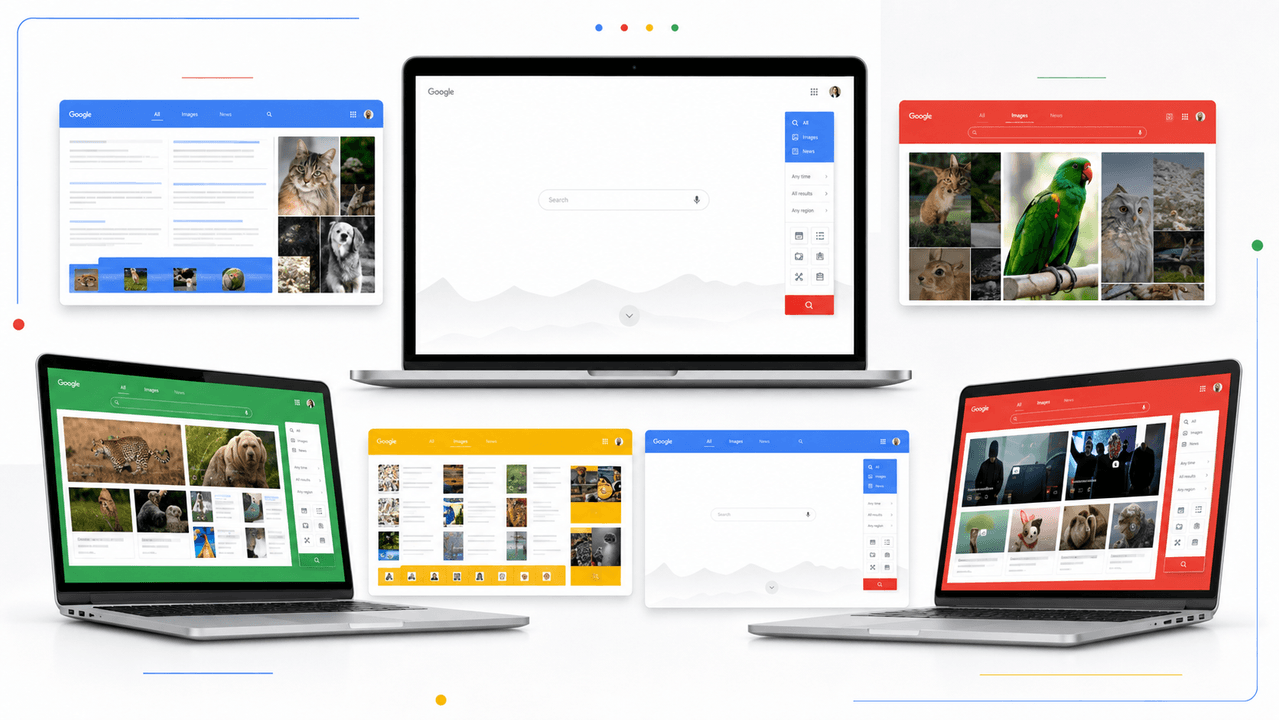
We retained the familiar search-first workflow while introducing cleaner layouts, more generous spacing, prominent visual content, and consistent navigation. Google’s core blue, red, yellow, and green colours were used to differentiate search categories and create a more engaging experience across web, image, video, and other result types.
Result
The final concept presented a cohesive and visually engaging direction for Google Search across multiple desktop experiences. Published on Behance in August 2017, the project has received approximately 2.4K views, 151 appreciations, 10 comments, and positive feedback from the creative community.